Chart
Here is an explanation of what a chart is and what it is used for. How to create and manage them.
INFO
If this is your first time knowing DatamineHub, you may wonder what DatamineHub does and whether it can meet your needs. You can quickly browse our brief introduction and main concepts
INFO
If you don’t have an account yet, you can give it a try. DatamineHub offers a permanent free tier, and no credit card is required for registration.
You can also start with mobile app and scan your barcode with mobile app for free.
WARNING
Chart feature is only available on DatamineHub Web App.
INFO
You can also watch the corresponding video (double click to full screen)
What's a chart?
A chart is used to visualize a report. So its premise is report. If you haven't created a report yet, or are not familiar with what a report is and how to create them, you can refer to the report documentation, where reports are explained in detail and how to use them. Here we assume that you already have a report or know how to create it.
[Double click the image to enlarge] 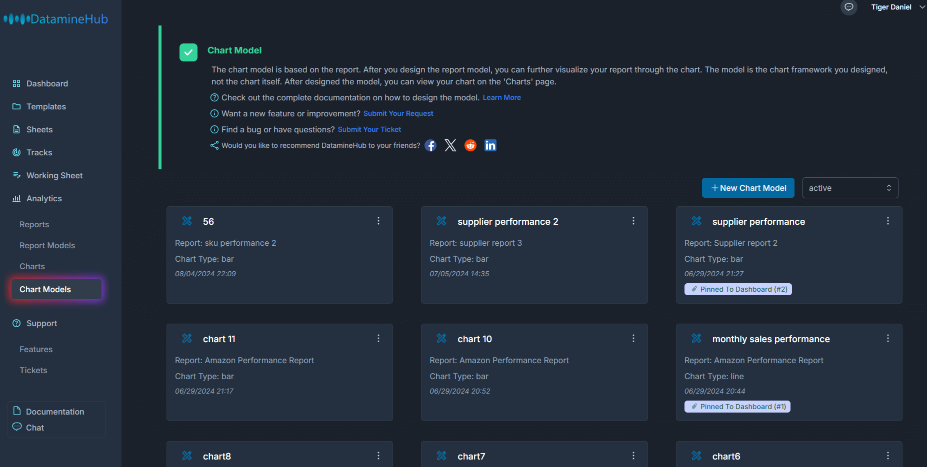
How to design a chart?
On the chart models page, we can create and manage chart models.
Click the new chart model button, and in the pop-up chart model creation box, enter a name and description. Then select the report you want to create a chart for. In this example, we choose the report model sales performance by sku.
[Double click the image to enlarge] 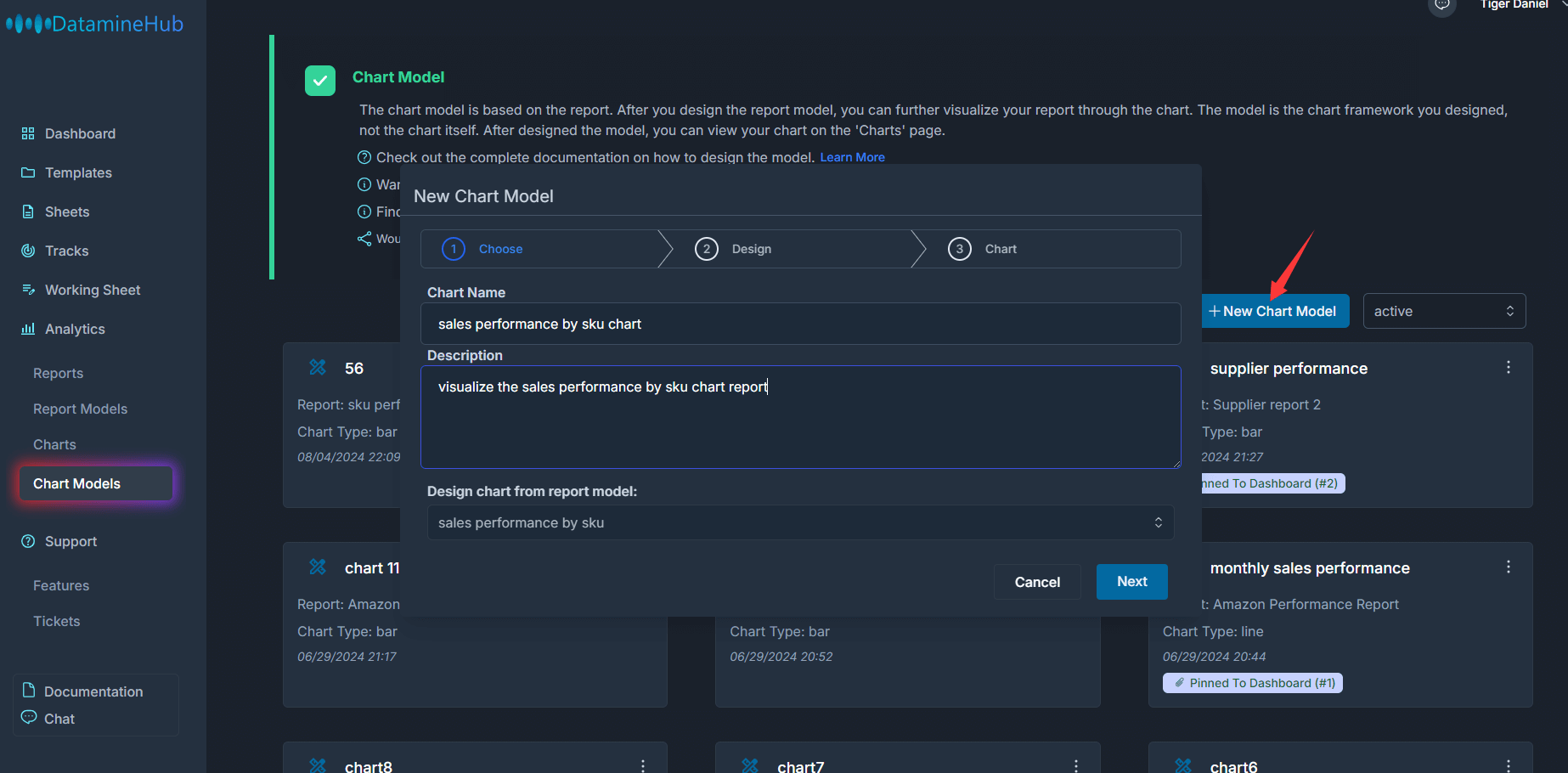
Click next to proceed to the next step.
[Double click the image to enlarge] 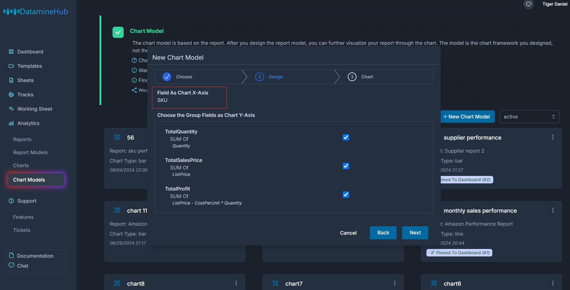
The horizontal axis of the chart comes from the group by field of the report. This is a fixed setting.
The vertical axis of the chart. We can choose which group fields and custom group fields in the report are included. in this example, all three fields are selected.
Click next to the next step.
[Double click the image to enlarge] 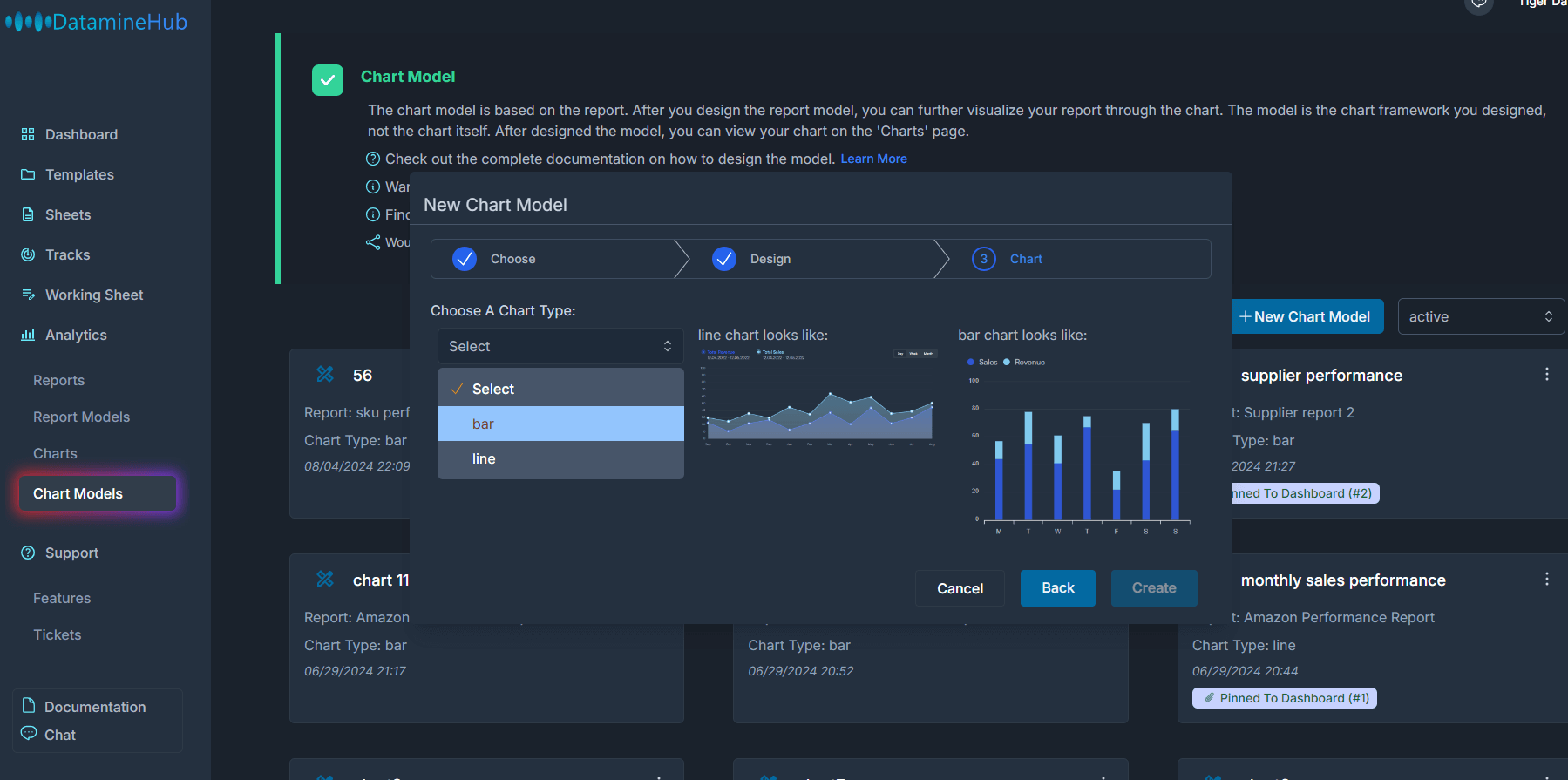
Usually, charts can have various display formats. The most common ones are bar and line. These are also the two formats we currently support. Choose the one you think is appropriate, such as bar.
[Double click the image to enlarge] 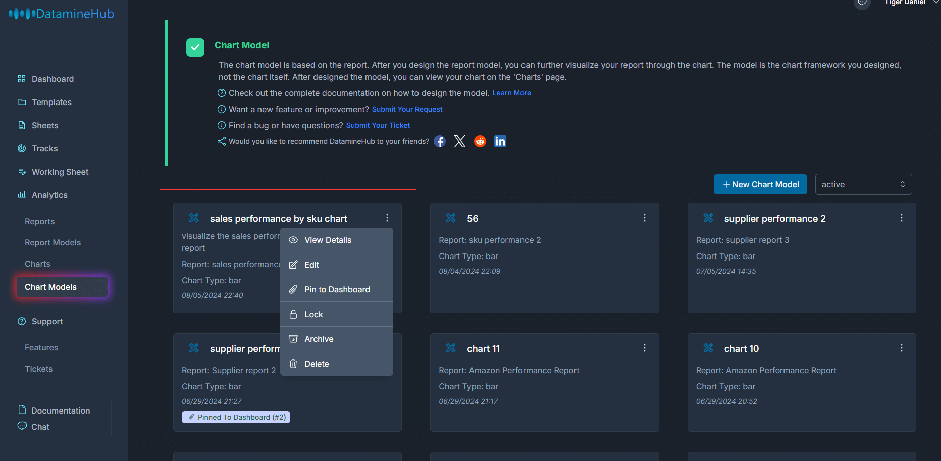
Now, the chart model is created. You can see it in the chart models page.
Manage Chart Model
View
In the operation menu, View details can view the design details of the chart model.
[Double click the image to enlarge] 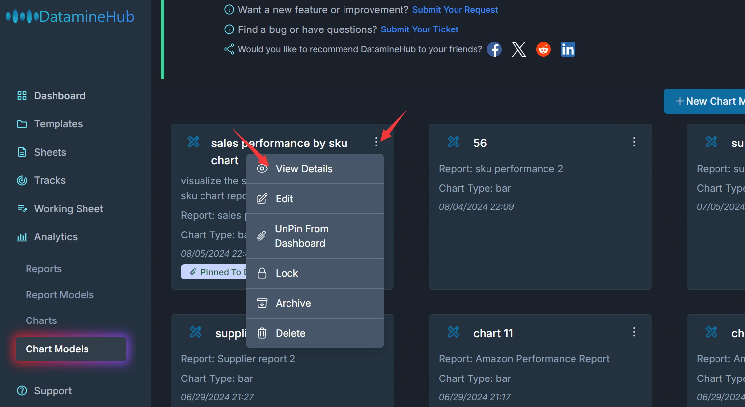
[Double click the image to enlarge] 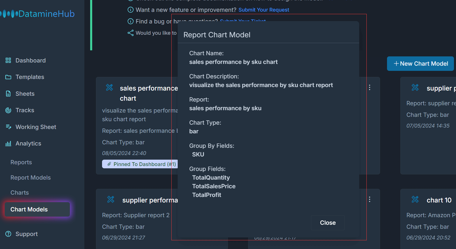
The modal tells the Chart Type, Group By Fields(X-Axis), Group Fiels(Y-Axis). What's the report it depends on.
Edit
Click the Edit button from the Operational menu, the Edit Report Model pops up.
[Double click the image to enlarge] 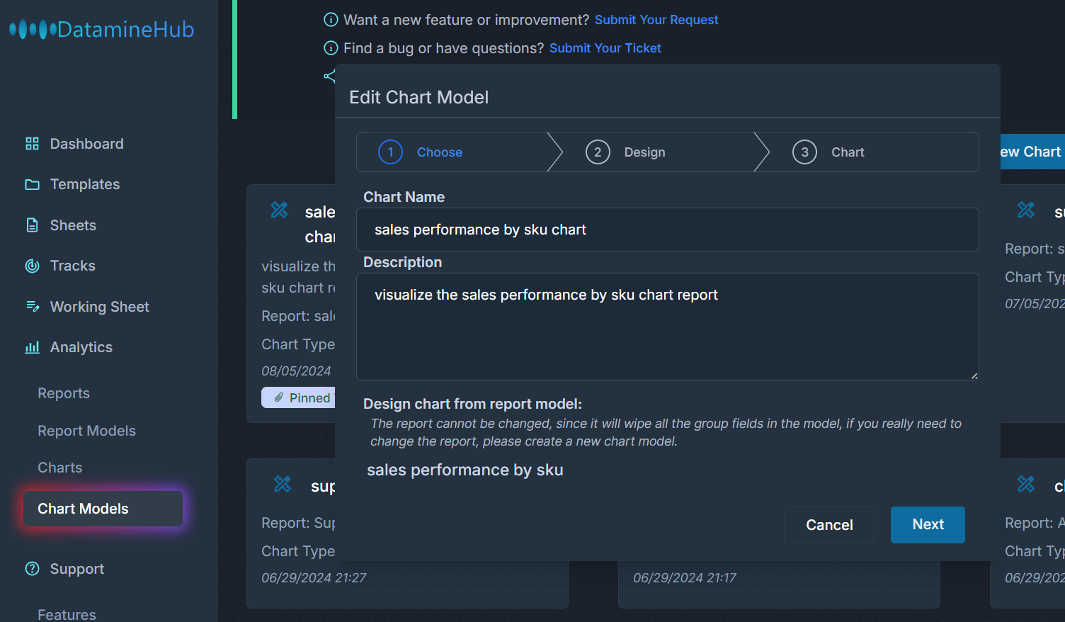
You can change Y-Axis elements, chart type(bar or line) also the Model Name and Description. But change the report the chart model based on is not allowed.
Pin To Dashboard or UnPin From Dashboard
Charts rely on reports, while reports are not refreshed in real time. When you just create a new report, we will prioritize it. Depending on the size of your data and the complexity of the report model. you may have to wait for 10 minutes or dozens of minutes. But after that, these reports will only be refreshed on a daily basis.
Therefore, the chart will only be generated when the report is ready.
Pin to dashboard allows you to select the two most important charts and display them on the dashboard page. The pinned to the dashboard charts will be refreshed hourly.
[Double click the image to enlarge] 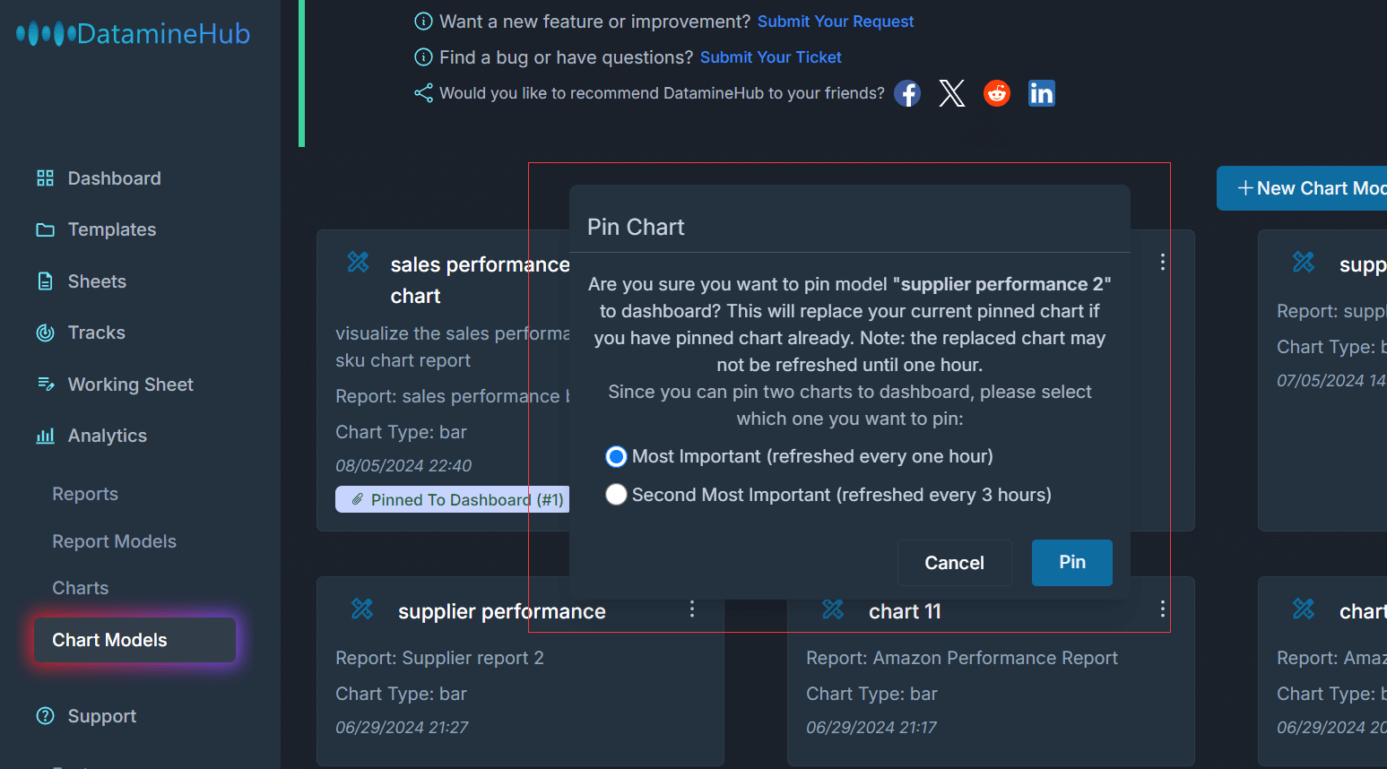
If your report is generated already, you can see your pinned charts in Dashboard page:
[Double click the image to enlarge] 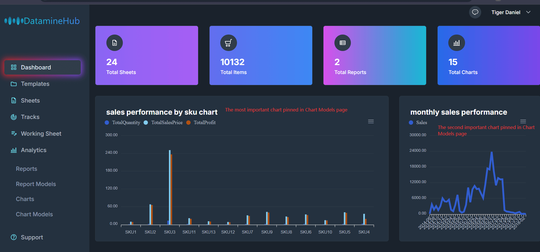
If a chart model is pinned, you can unpin it from dashboard again.
[Double click the image to enlarge] 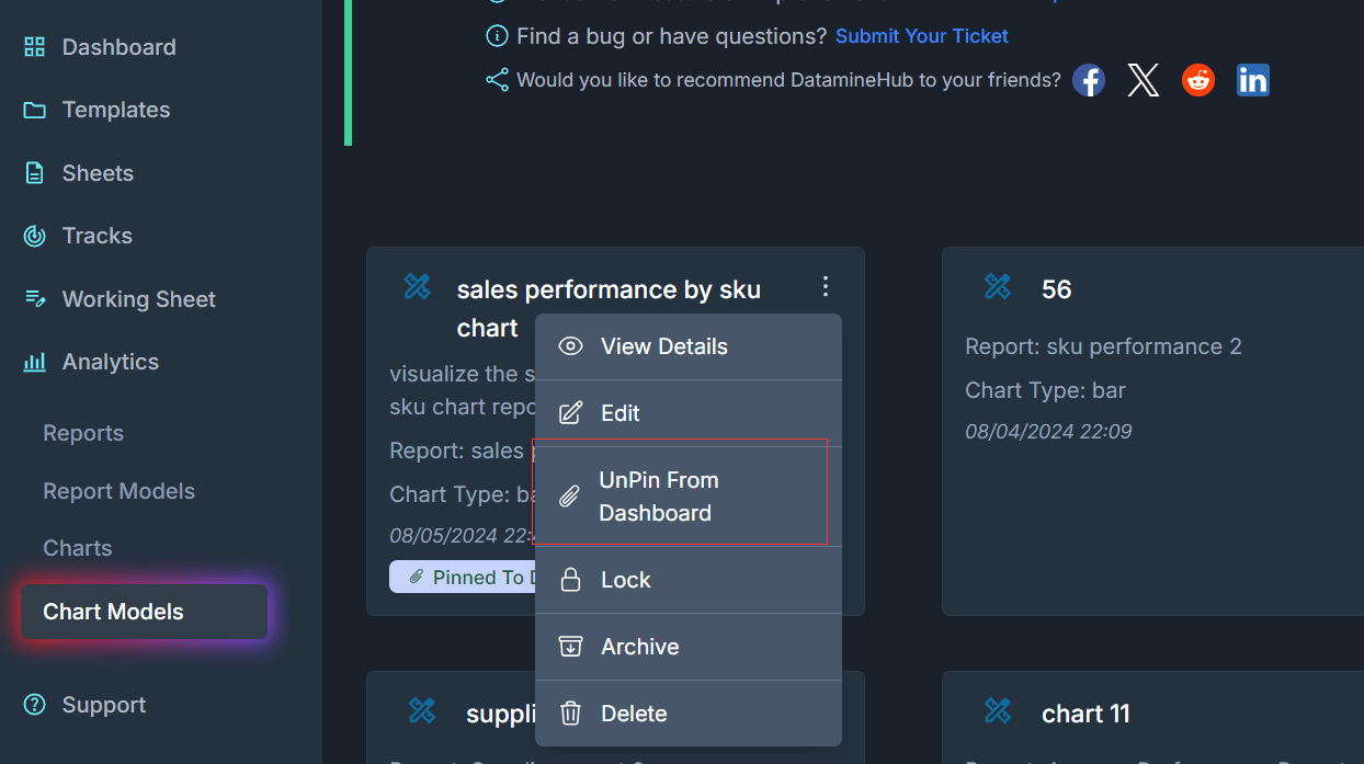
Lock
[Double click the image to enlarge] 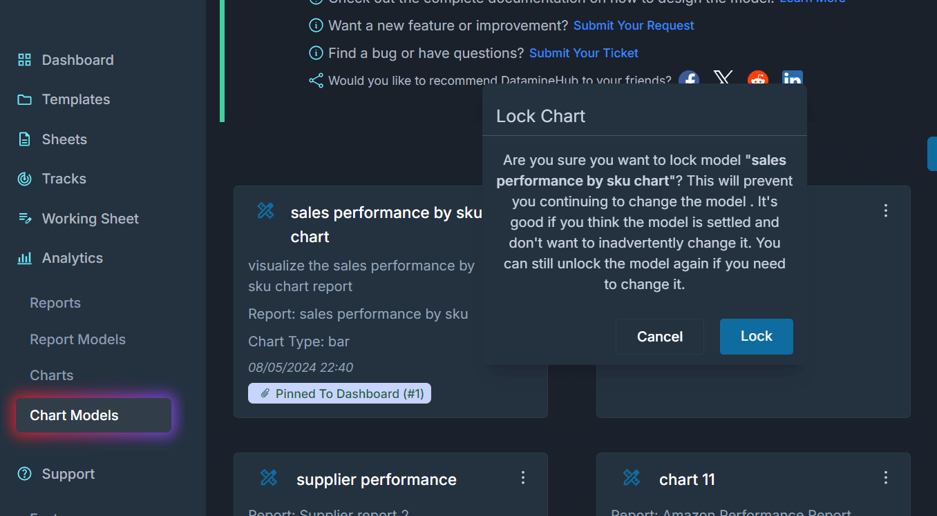
Lock can lock the chart model to prevent accidental modification or deletion.
[Double click the image to enlarge] 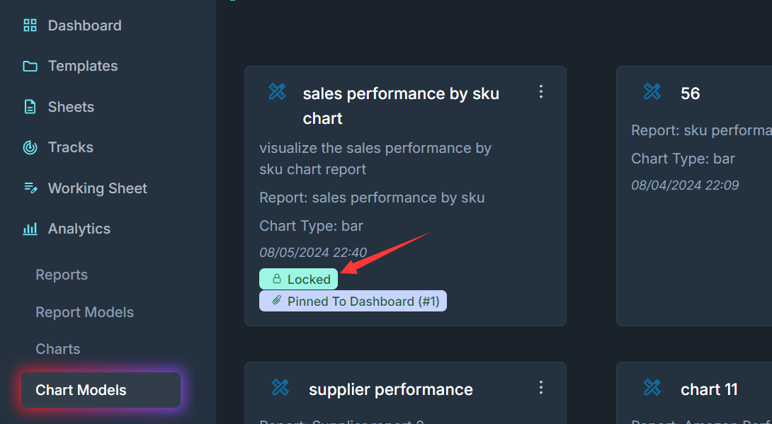
Once the chart is locked, you would see the Locked tag.
[Double click the image to enlarge] 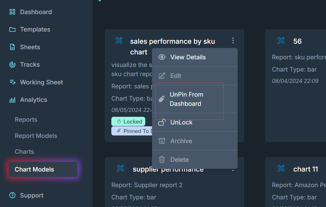
Now, the Lock button becomes UnLock, so you can unlock the chart model if you need to edit it.
Archive
[Double click the image to enlarge] 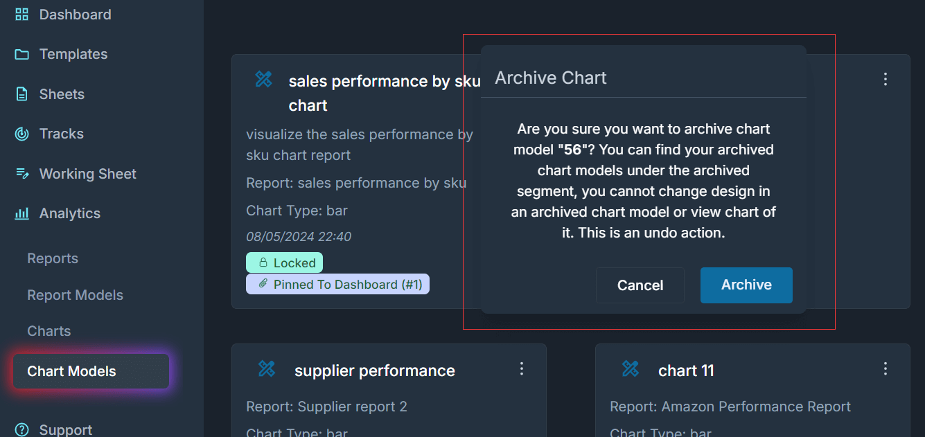
The archived chart model will not have the chart, but it can be used as a reference.
Delete
[Double click the image to enlarge] 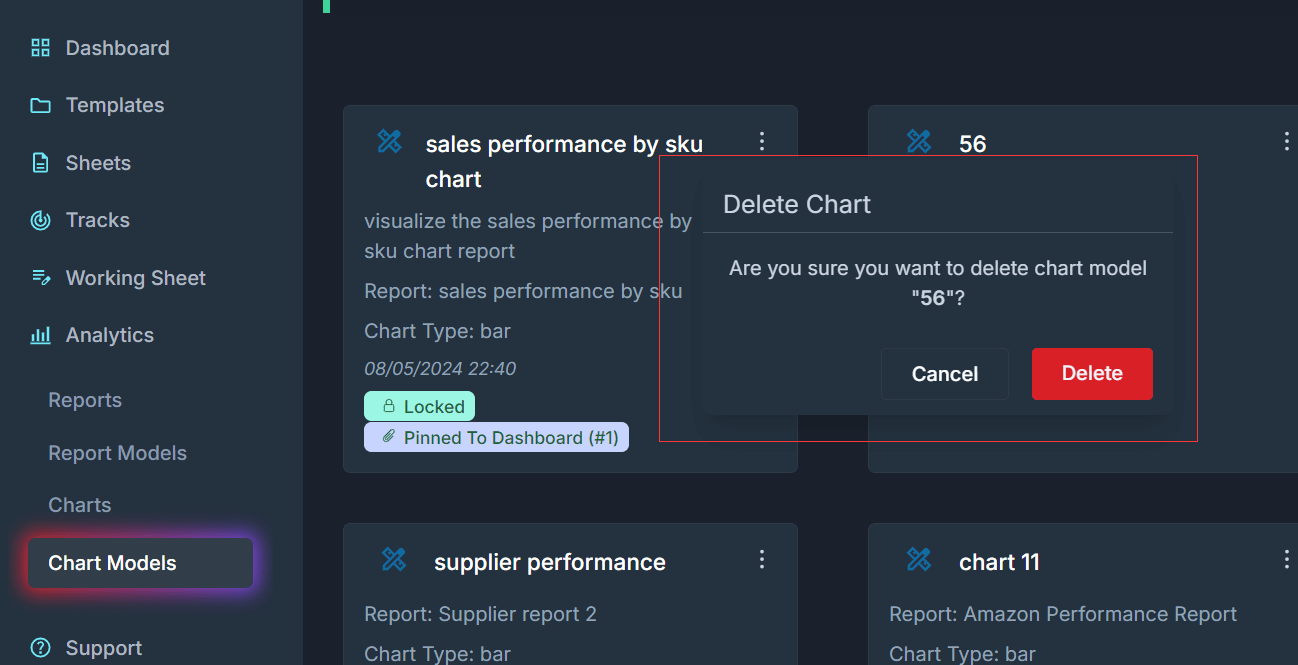
Delete will delete it permanently.
View Charts
[Double click the image to enlarge] 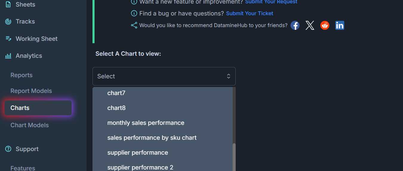
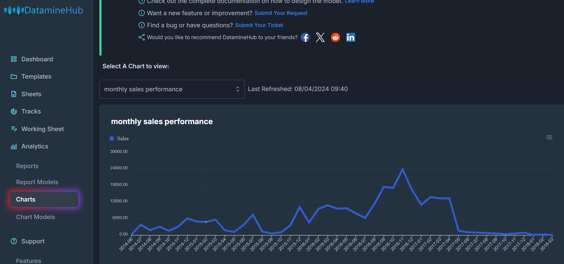
The chart model defines the instructions how the chart should be generated on the report. To view the charts. Navigate to Analytics -> Charts. Your active chart models are in the list. Choose one to view the chart:
[Double click the image to enlarge] 