Report
Here is an explanation of what a report is and what it is used for. How to create and manage them.
INFO
If this is your first time knowing DatamineHub, you may wonder what DatamineHub does and whether it can meet your needs. You can quickly browse our brief introduction and main concepts
INFO
If you don’t have an account yet, you can give it a try. DatamineHub offers a permanent free tier, and no credit card is required for registration.
You can also start with mobile app and scan your barcode with mobile app for free.
WARNING
Report feature is only available on DatamineHub Web App.
INFO
You can also watch the corresponding video (double click to full screen)
What's a report?
Report is used to analyze your data in sheet. Let's say you have a sheet containing order data. It has a total of 33 items. Each item contains OrderId, SKU, List Price, Quantity, CostPerUnit, Supplier, and Sold Date. Seeing such data, you may want to analyze it further. Naturally, you may want to know how much SKU2 sold in total, what is the total cost of SKU2, and what is the profit. Or, what is the profit of SupplierA. How is the return on investment. For statistical information such as these, we need to do some data aggregation operations on a certain field. That is report.
In DatamineHub, we do not limit the report to a fixed type. You can design the report you want as you like. You can do it easily with our simple, powerful and easy-to-use report designer.
Check below screenshot, this is Sheet AmazonOrders_20240803, we will create a report model based on this sheet.
[Double click the image to enlarge] 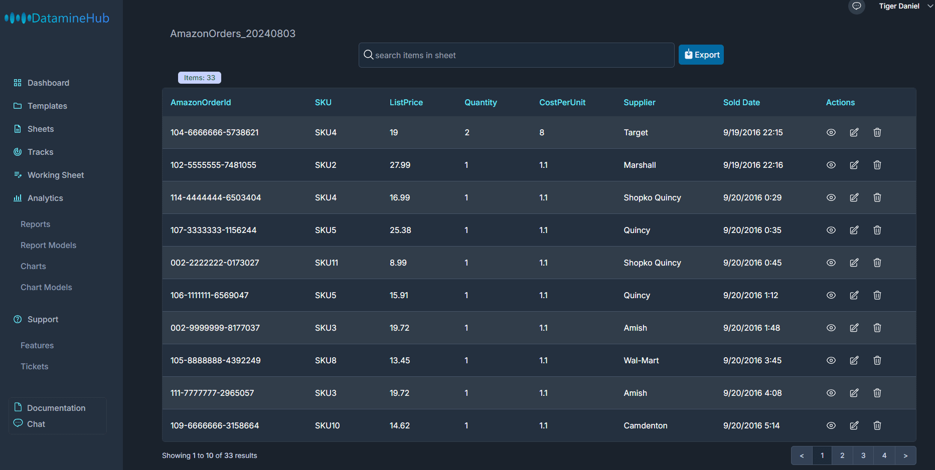
How to design a report?
There are four pages under Analytics in the left navigation bar, Reports, Report Models, Charts, and Chart Models.
The Reports page can be used to view the specific content of each designed report. And Report Models is used to describe the model of the report. Generally speaking, we design our report on the report models page first, and then view the specific generated report content on the reports page after the design is completed. Reports are not generated in real time. There are daily and hourly reports, which we will talk about in detail later. Let's first look at how to design a report.
Click the New report model button, and the model creation box will be displayed. The entire design process is divided into three steps.
[Double click the image to enlarge] 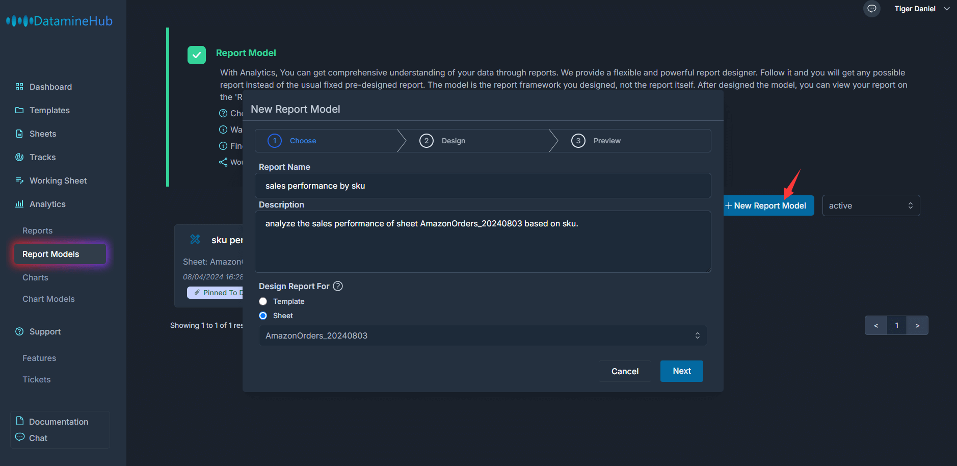
In step one, enter the report name and description. In Design report for, there are two different options: template and sheet. When we select template. We can select any active template in the drop-down list. In other words, it will generate report for all sheets data based on the selected template. For example, there is a template A, and there are 3 sheets based on this template A. If we design a report based on this template A, then this report will be generated according to these 3 sheets. In other words, reports based on templates can span multiple sheets. If you select sheet, you can only create a report for that selected sheet. You can decide whether to choose template or a specific sheet based on your actual situation. In our example, A sheet is selected.
Click the Next button to go to the second step. This step contains more details. Let's take a look at the general structure first. It is divided into three parts. Group By. Group Fields. Custom Group Fields. Let's go through each one.
[Double click the image to enlarge] 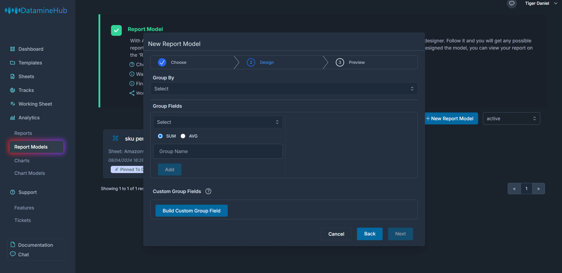
- Group By
Group By means from which angle to analyze the data. For example, you have 100 inventory items from 3 different suppliers. You want to know the average price of each supplier. Then you can divide these 100 inventory items into three categories according to these 3 suppliers, and then calculate the average price of each category. In this example, we group by Supplier. Or as in the example at the beginning, a batch of order data. If you want to know the sales of different SKUs, we can classify the data by SKU, and then calculate the sales of each SKU category.
[Double click the image to enlarge] 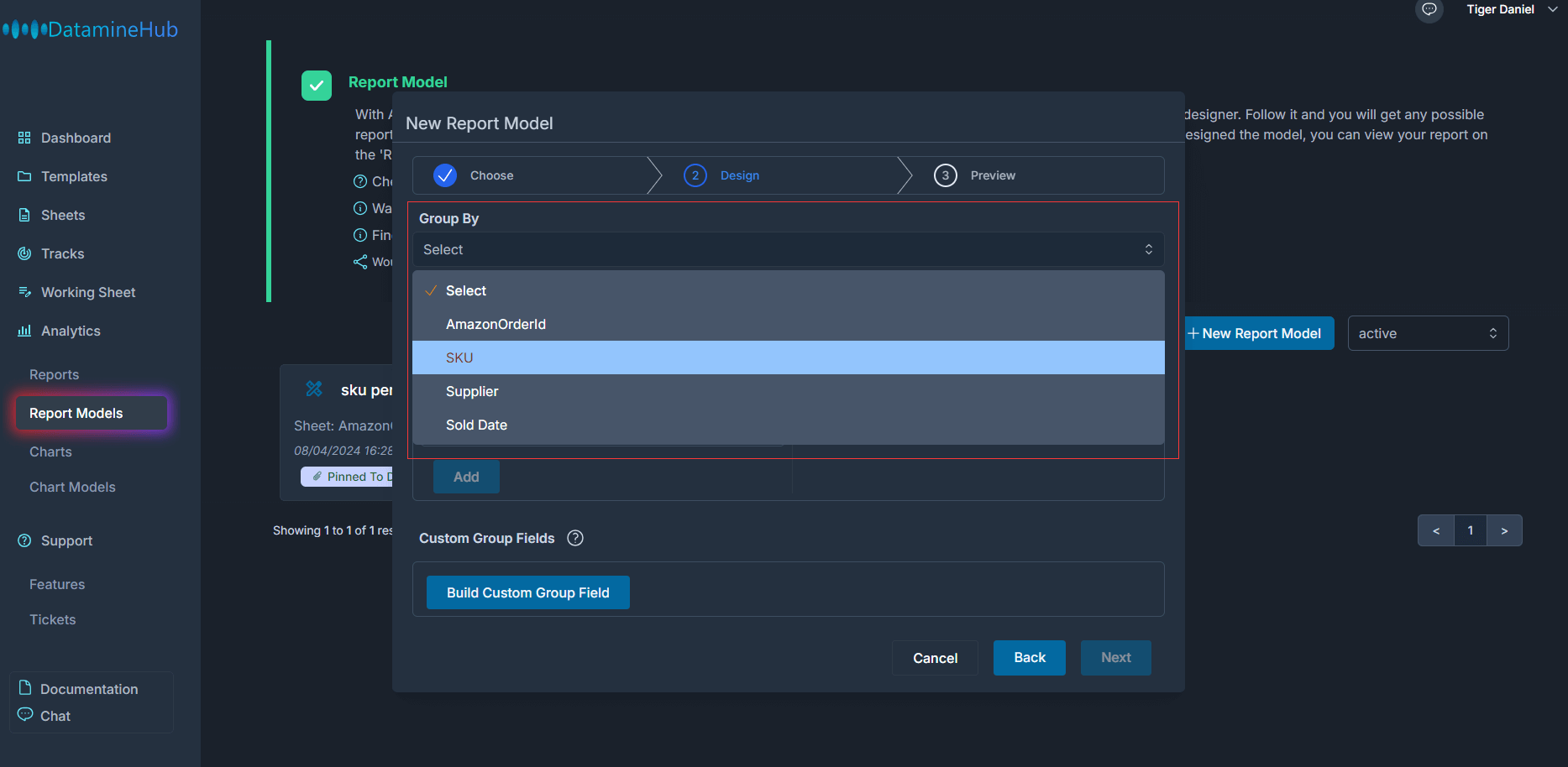
Usually we may choose to group by SKU, supplier, and other fields that can be clearly classified. However, there is an exception, that is, date. A very common requirement is to know how the data is in different periods, such as the sales volume of each month. In this case, we set group by to a date. And the range is divided by year, quarter, month, and day. The default is monthly.
[Double click the image to enlarge] 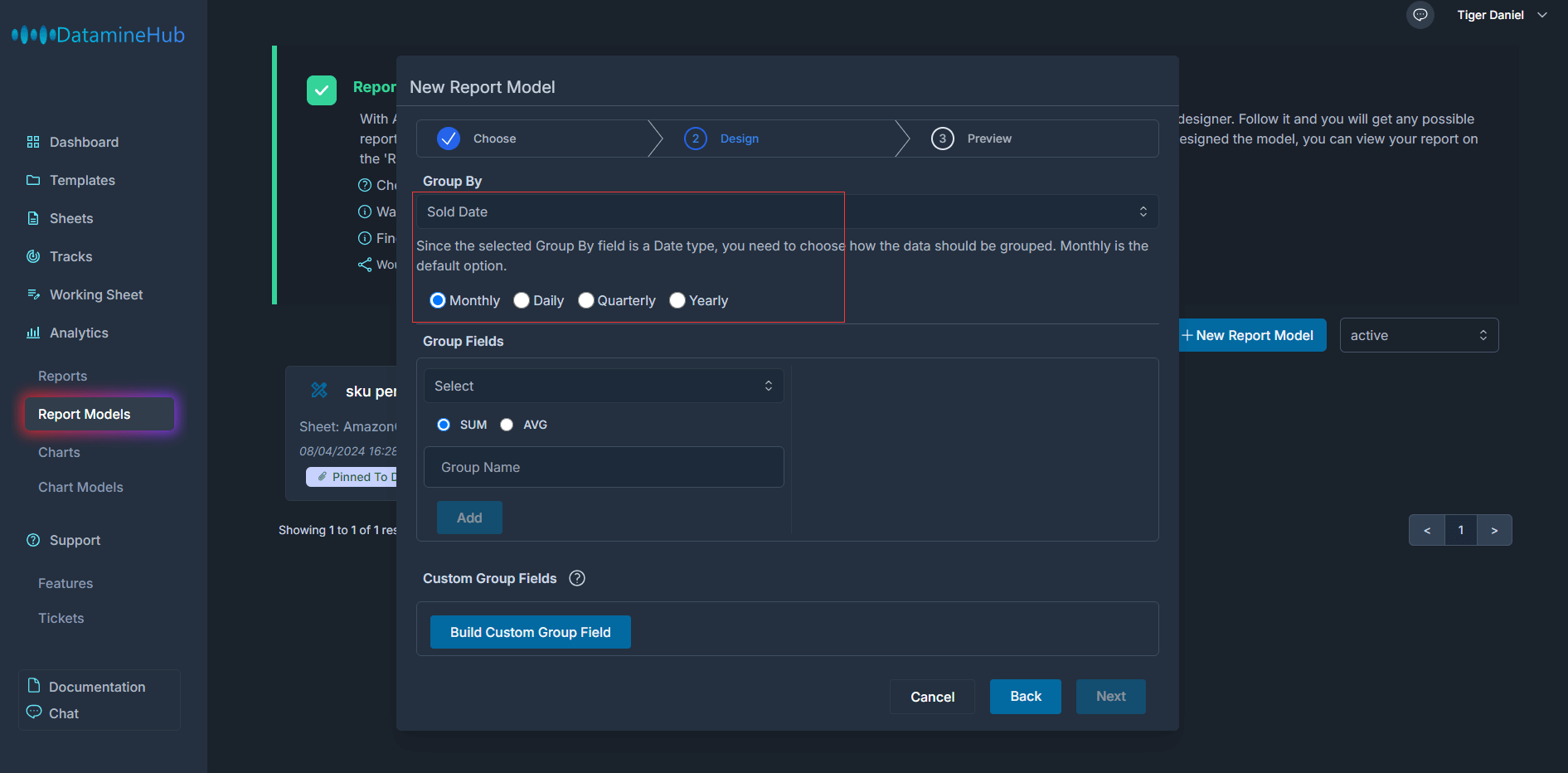
- Group Fields
Group Fields is how to count the data according to classification. in this example. We selected Group By SKU. Based on the SKU classification, we can find out how many products each SKU has sold and the total sales price. To do this, we can select the Quantity field and the ListPrice field, and select SUM, which is also the default setting. SUM means summation, which is to add up the values of the field based on the group by classification. AVG means average, which is to calculate the average value of the field based on the group by classification.
[Double click the image to enlarge] 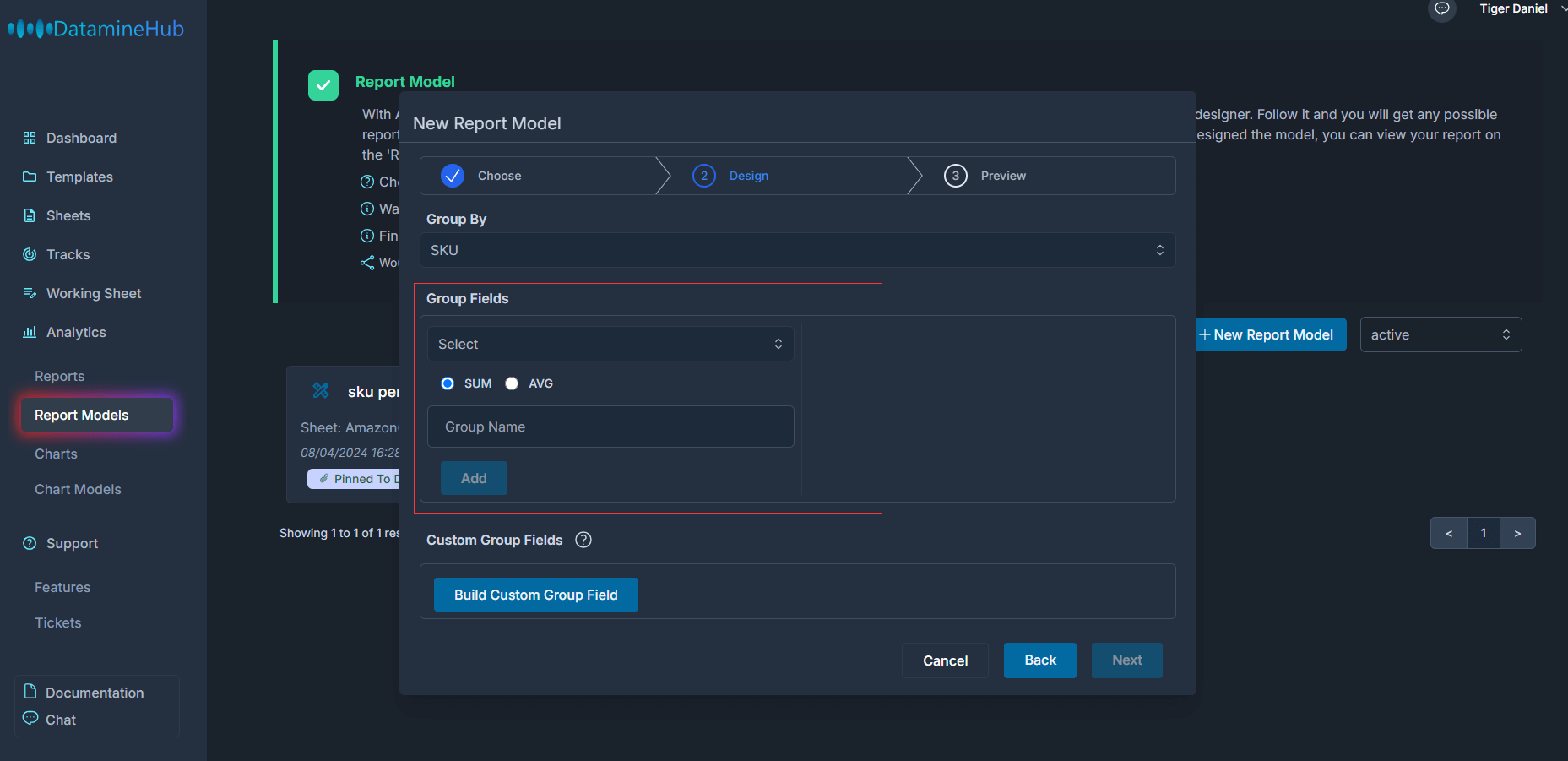
Next, let's add these two group fields and set the corresponding names.
[Double click the image to enlarge] 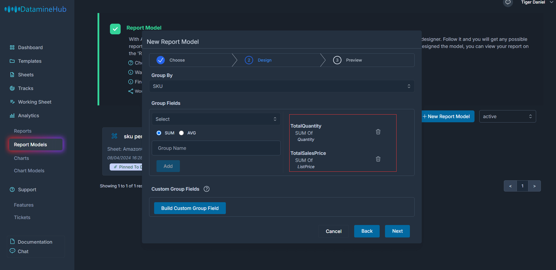
You can see that we have just added two Group Fields, Total Quantity and Total Sales Price. Total Quantity is the sum of quantity. Total sales price is the sum of list price. Note that these calculations are classified according to the field set by Group by, such as SKU in this example. That is to say, different SKUs belong to different categories, and their quantities and list prices will not be counted together. Only those order data with the same SKU will have their quantities and list prices counted together.
- Custom Group Fields
Now let's look at Custom Group Fields. To understand what it is, let's go back and look at the sheet on which our example report is based. The sheet contains order id, sku, list price, quantity, costperunit, supplier, sold date.
We just created total quantity and total sales price through group fields. But what if we want to know the profit? There is no profit field in this sheet. We can't create it through group fields. This is where Custom Group Fields comes in.
[Double click the image to enlarge] 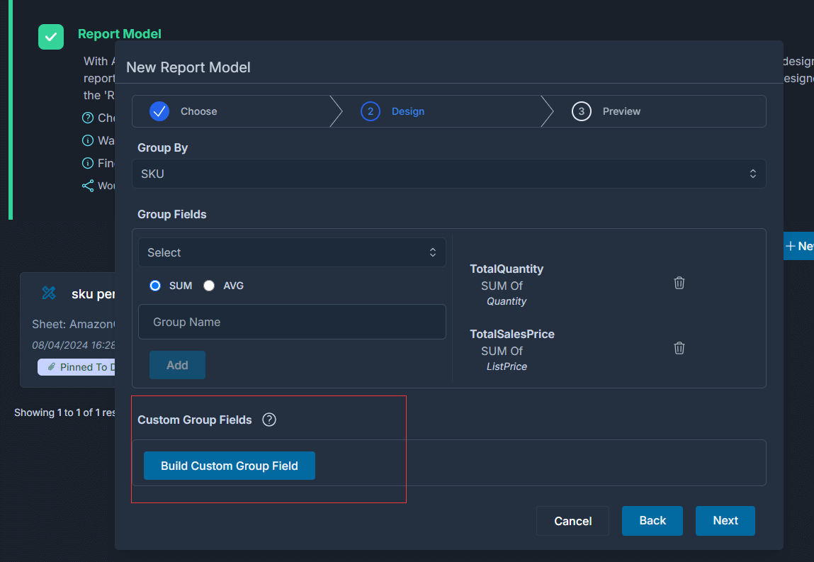
We know that for an item, its profit = ListPrice - BuyCost. And BuyCost = CostPerUnit X Quantity. As long as we know the profit of a single item. Then according to the group by field, we can calculate the total profit.
Custom Group Fields allow us to create such mathematical expressions. It is similar to Field Type formula. If you are not familiar with formula, you can refer to the documents and videos related to Field type formula.
Now, let's create a profit field. Click the Build Custom Group Field button to pop up the Custom Group Field Builder window. First, give this custom group field a name, such as TotalProfit. Select SUM because we want to calculate the total profit.
[Double click the image to enlarge] 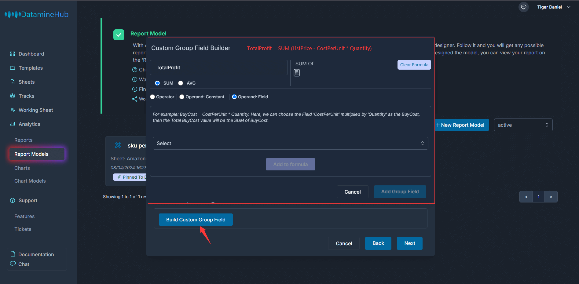
Operator, Operand constant, operand field, these three options have the same meaning as field formula. If you are not sure what they mean, you can refer to the video and document of field formula. We will also quickly explain it here.
Operator is an operator such as addition, subtraction, multiplication, division and brackets. Operand constant is a constant. Operand field is a field in the sheet. For example, in our example, it is a number, decimal, and other numeric fields such as List price, cost per unit, and quantity. Now let's construct the mathematical expression of this TotalProfit field as below video shows:
We have just created a custom group field named TotalProfit, and its value = SUM of ListPrice - CostPerUnit * Quantity
[Double click the image to enlarge] 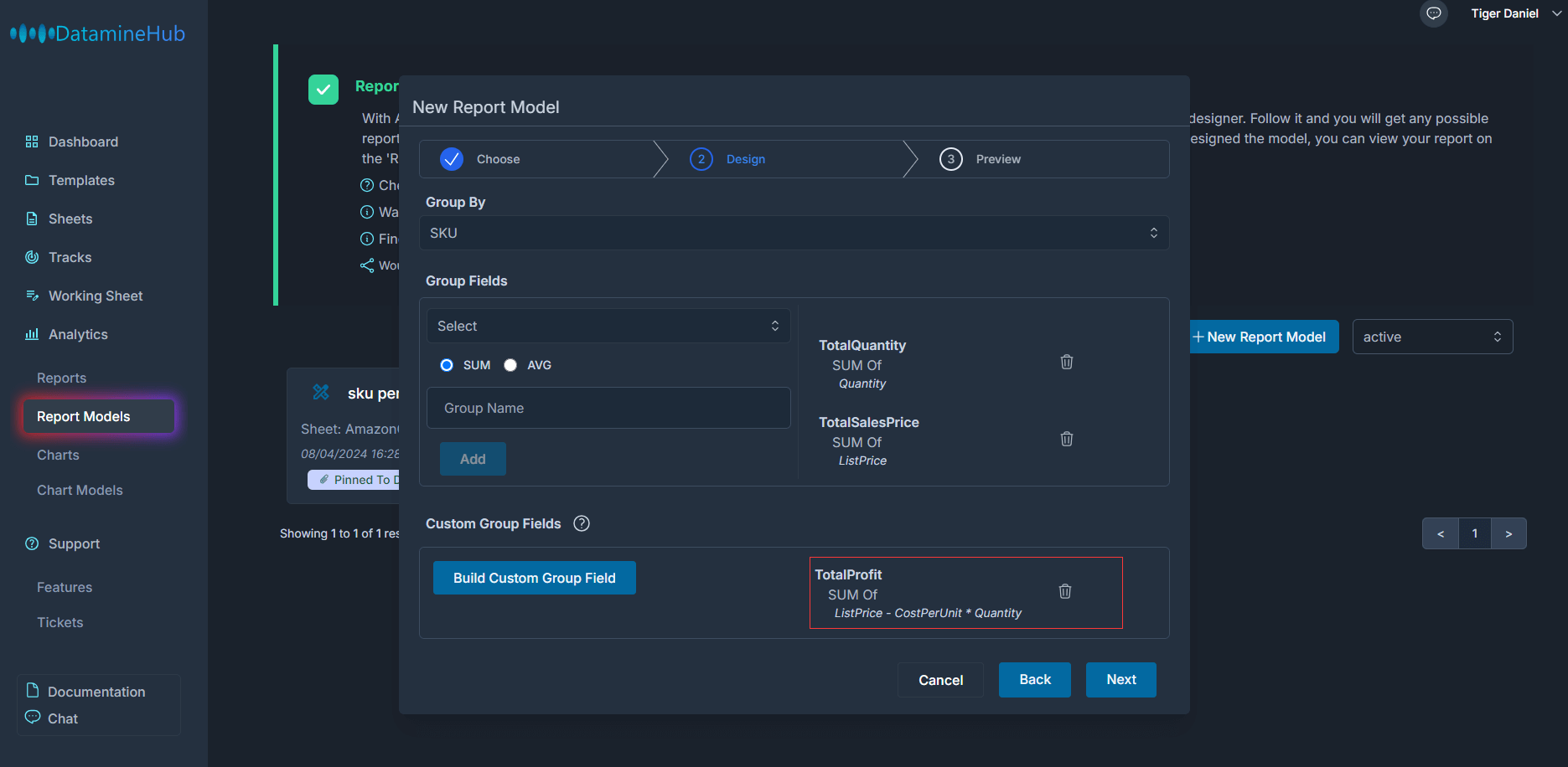
You can create as many custom group fields as you want. If you find that one is wrong, you can delete it by clicking the trash icon next to it and create it again.
Click the Next button to the next step.
[Double click the image to enlarge] 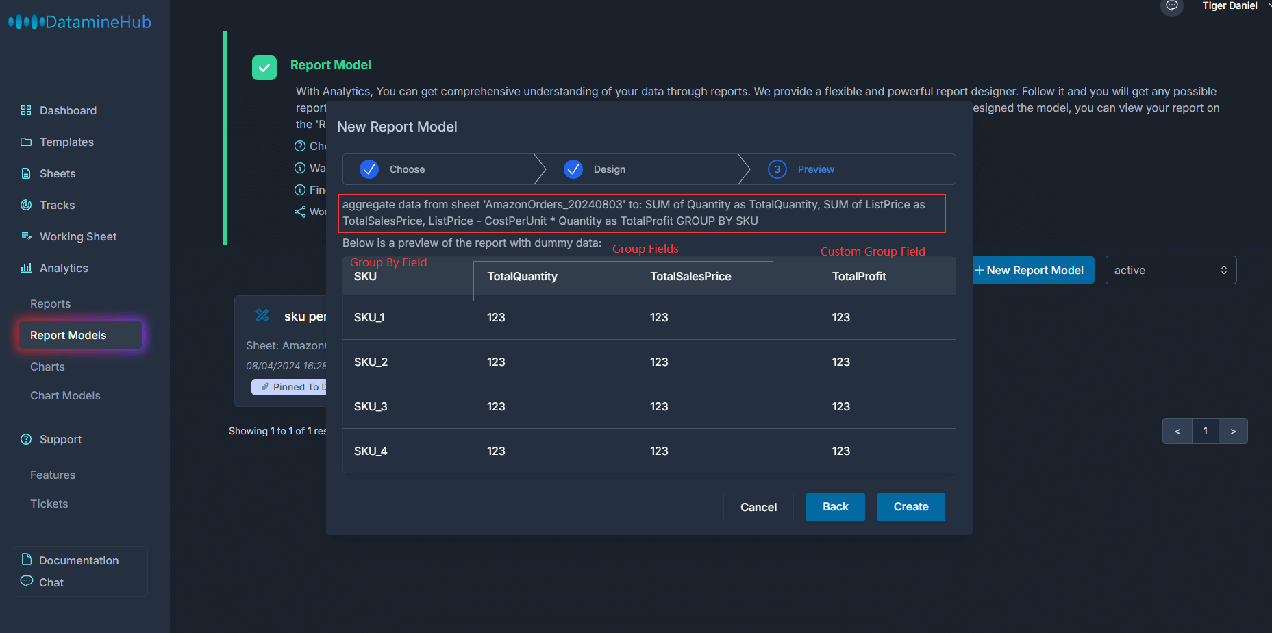
In the last step Preview, summarize how the report is designed. An example of dummy data is also given. in this example,
For the order data in the sheet, we classify them by SKU, which is the Group By. We calculate the total quantity, the total list price, and the total profit. However, profit is not a field in the original sheet, so we create an expression through the custom group field builder. Click the create button to create the report model.
[Double click the image to enlarge] 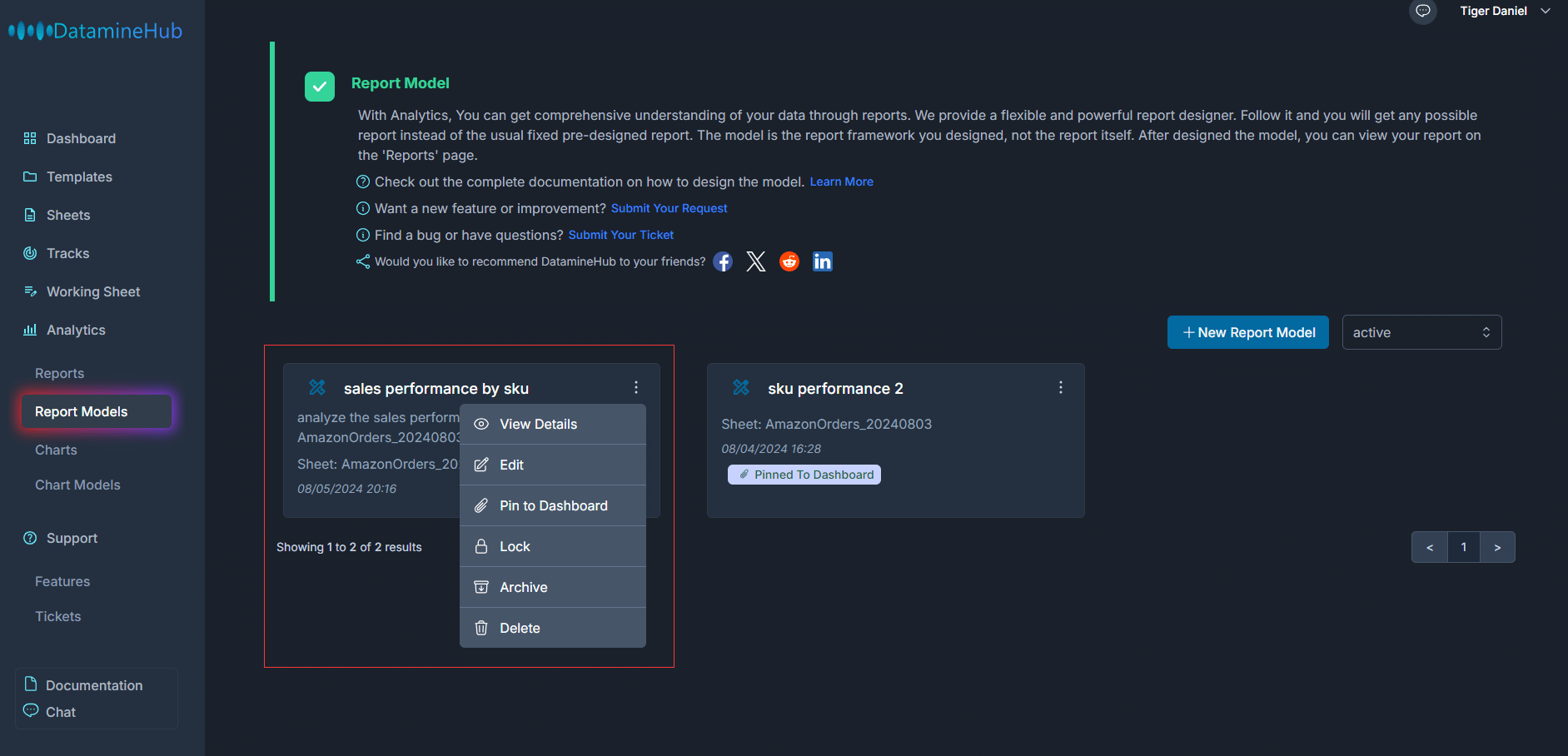
the report model is created. You can see it in the Report Models page.
Manage Report Model
View
In the operation menu, View details can view the design details of the report model.
[Double click the image to enlarge] 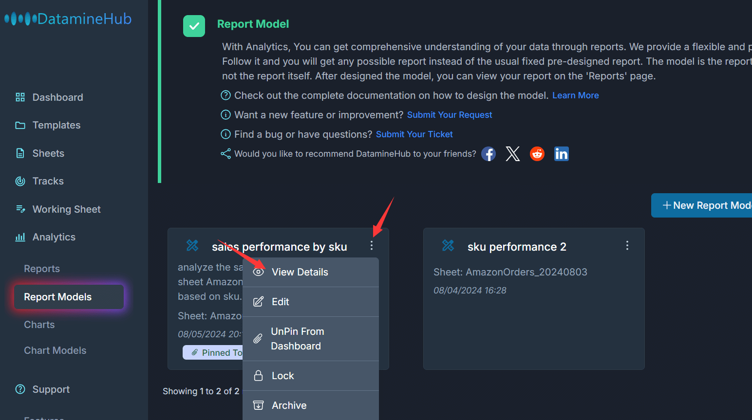
[Double click the image to enlarge] 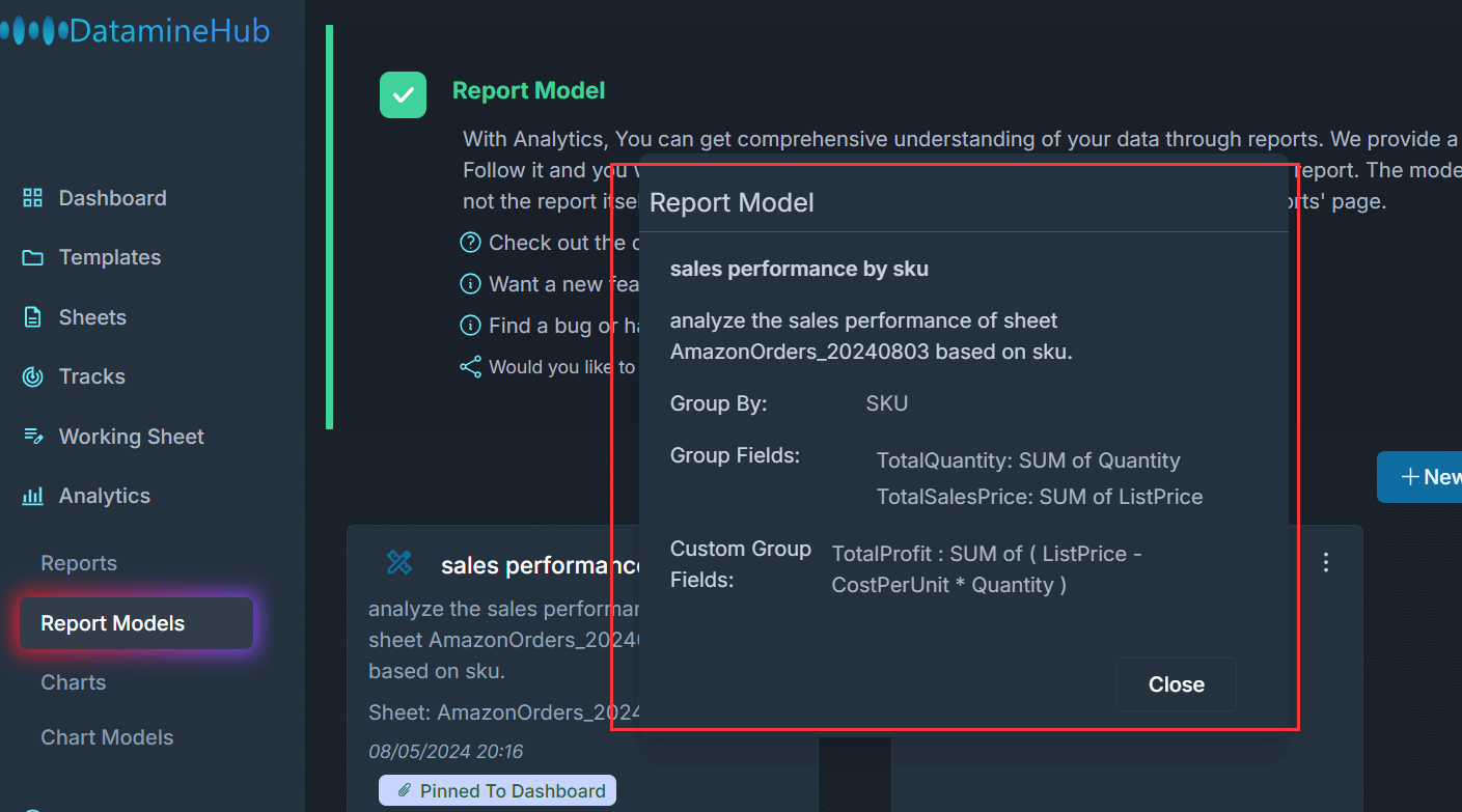
The modal tells the Group By, Group Fields, and the Custom Group Fields.
Edit
Click the Edit button from the Operational menu, the Edit Report Model pops up.
[Double click the image to enlarge] 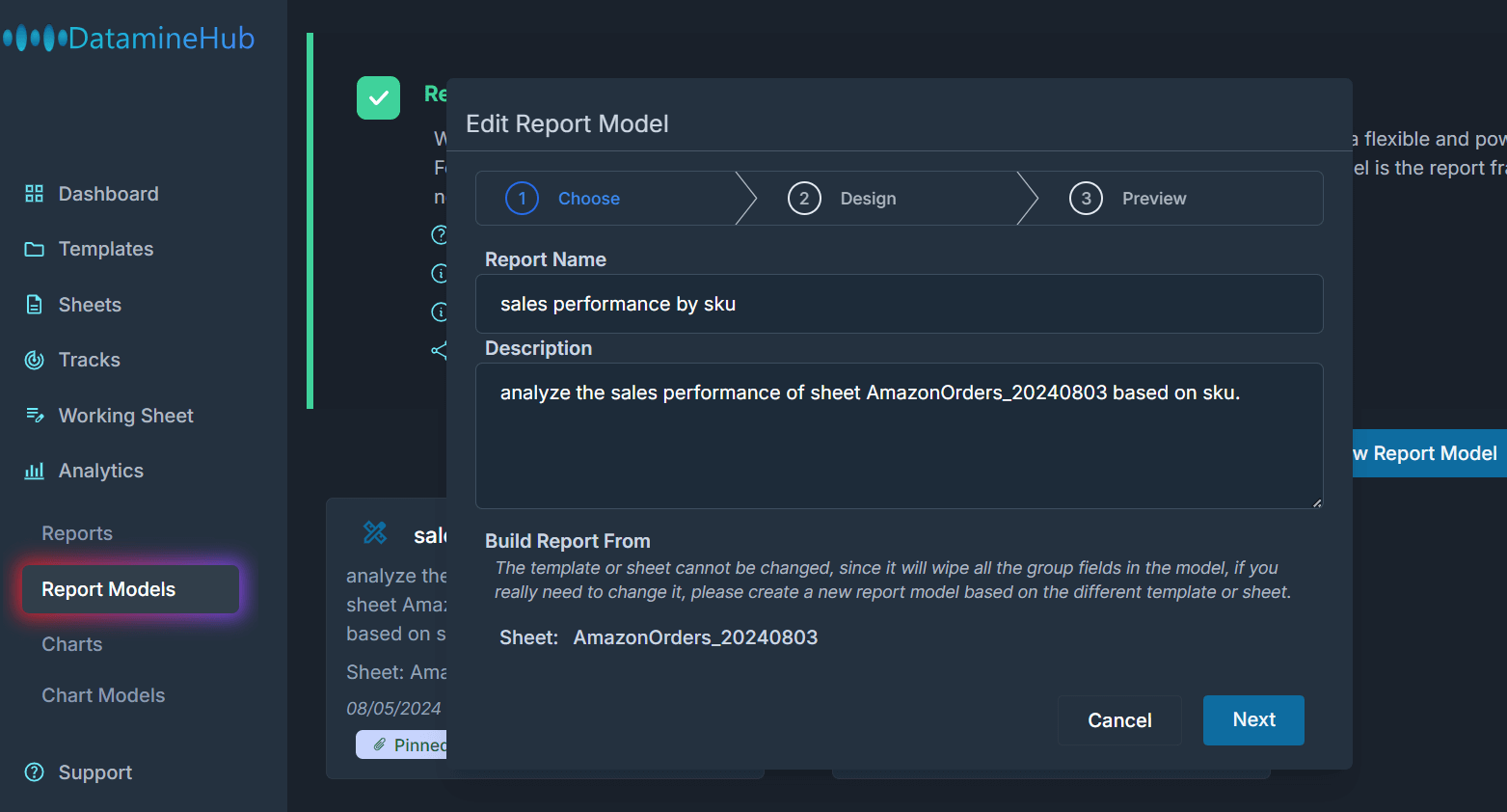
You can change the Group By, Group Fields and the Custom Group Fields, also the Model Name and Description. But change the sheet or template the report model based on is not allowed.
Pin To Dashboard or UnPin From Dashboard
By default, reports are not refreshed in real time. When you just create a new report model, we will prioritize it. Depending on the size of your data and the complexity of the report model. you may have to wait for 10 minutes or dozens of minutes. But after that, these reports will only be refreshed on a daily basis. Pin to dashboard allows you to select the most important or most frequently used report and display it on the dashboard page. The pinned to the dashboard report will be refreshed hourly.
[Double click the image to enlarge] 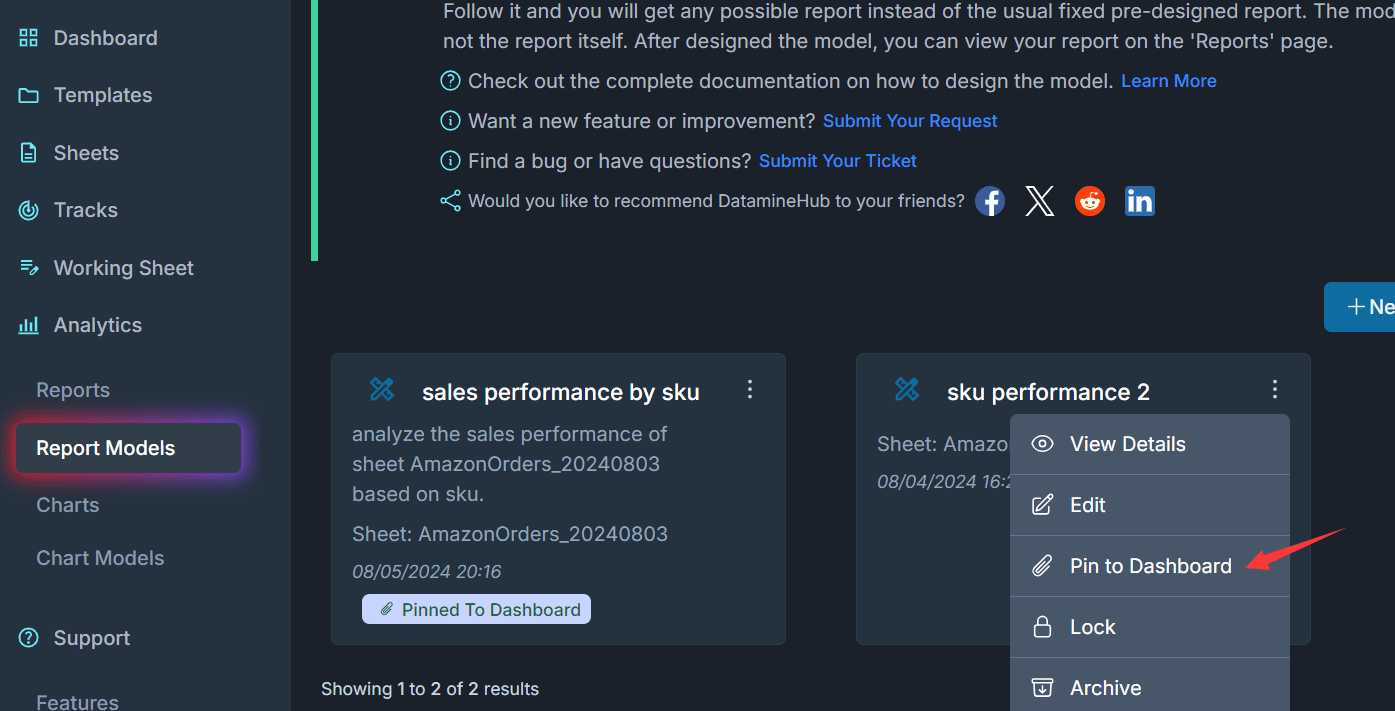
If your report is generated already, you can see your pinned report in Dashboard page:
[Double click the image to enlarge] 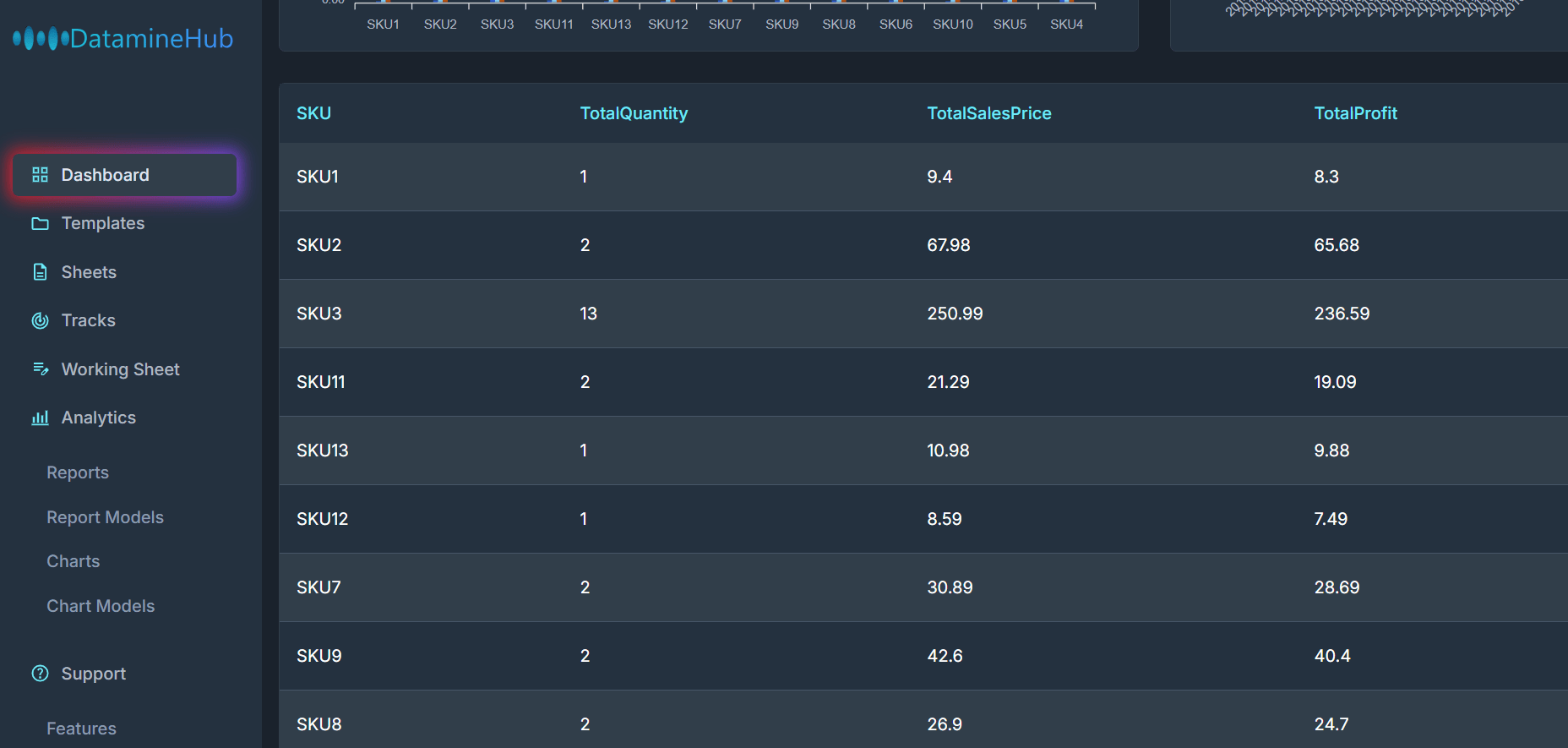
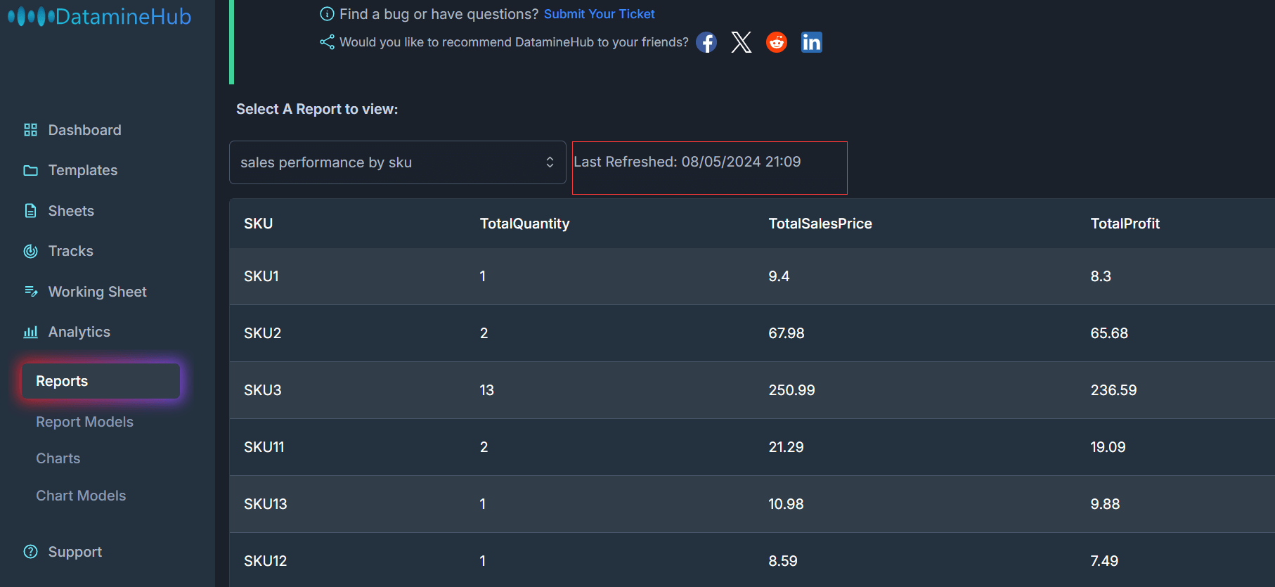
You can see, this report has three fields: TotalQuantity, TotalSalesPrice, TotalProfit, Grouped by SKU. This is exact the report model we designed in above section.
[Double click the image to enlarge] 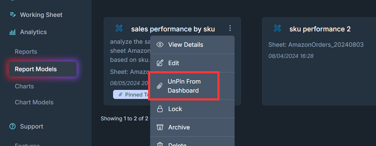
If a report model is pinned, you can unpin it from dashboard again.
Lock
[Double click the image to enlarge] 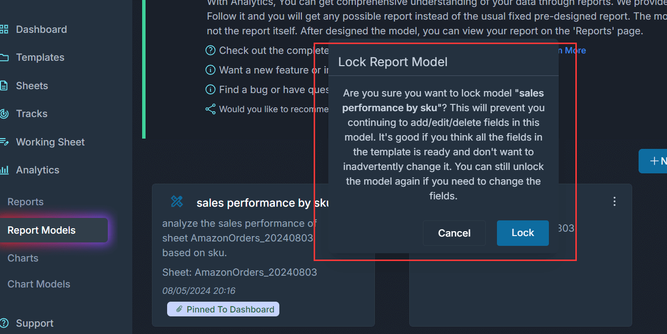
Lock can lock the report model to prevent accidental modification or deletion.
[Double click the image to enlarge] 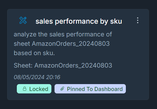
Once the report is locked, you would see the Locked tag.
[Double click the image to enlarge] 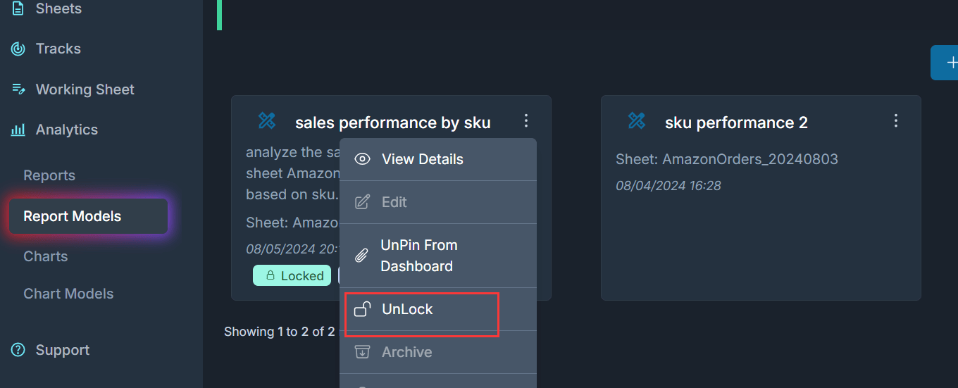
Now, the Lock button becomes UnLock, so you can unlock the report model if you need to edit it.
Archive
[Double click the image to enlarge] 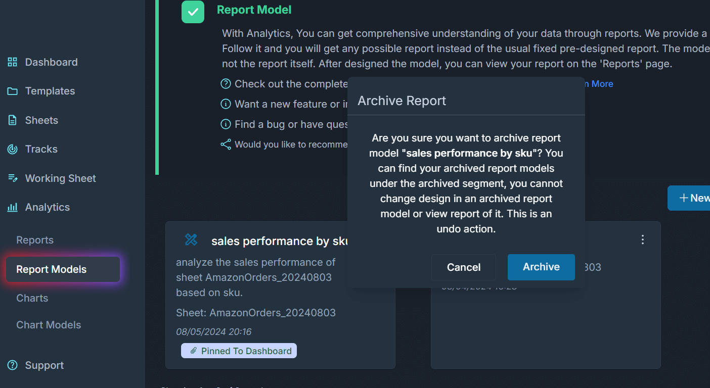
The archived report model will not have the report, but it can be used as a reference.
Delete
[Double click the image to enlarge] 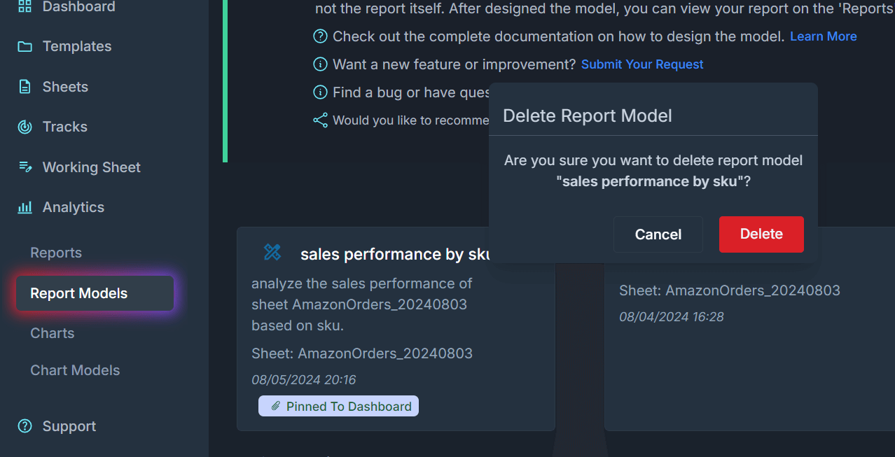
Delete will delete it permanently.
View Reports
[Double click the image to enlarge] 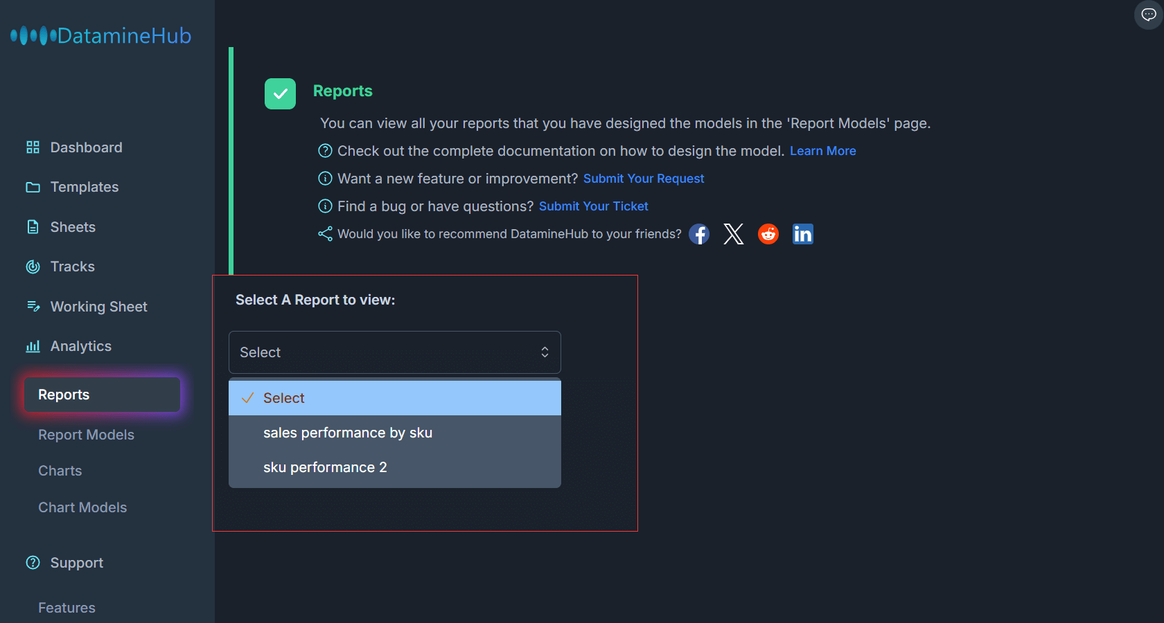
The report model defines the instructions how the report should be generated on the data. To view the reports. Navigate to Analytics -> Reports. Your active report models are in the list. Choose one to view the report:
[Double click the image to enlarge] 